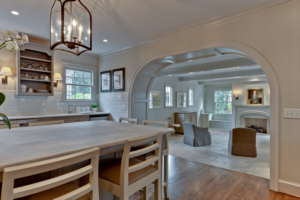


Problem: Creating a design that stands the test of time both in terms of quality and style.
Solution: Gave it a modern farmhouse look with elements of traditional interior design such as wall sconces, bronze metal finishes, and marble countertops.
Project: Kitchen renovation and living area addition
Name: Room Addition and Kitchen Renovation in Myers Park
Architect: Josh Allison
Making Old-World Modern
As a Charlotte remodeling company, Hopedale Builders knows how big of an investment a home improvement can be. So, we’re big believers in creating designs that stand the test of time both in terms of quality and style. And that’s exactly what we set out to do with this Myers Park, Charlotte remodel and addition.
We started with a white and gray color palette; neutral and easily adapted, it’s one of the most timeless color combos of all time, especially for a kitchen. But when you have such muted colors, you need to make a statement elsewhere. And the Hopedale Builders team did just that, mixing soft and hard textures, the rich colors of warm wood flooring, cast stone, custom wood molding, and other sophisticated details to elevate our design. The end result: a modern twist on old-world elegance.
To achieve this modern farmhouse look, we incorporated elements of traditional interior design such as wall sconces, bronze metal finishes, and marble countertops as well as a subway tile backsplash, pot filler, and farmhouse sink. These elements and materials have been used inside homes for a hundred years or more. As such, they have become venerable classics and they’ll never truly go out of style!
We balanced the effect of these antique touches with contemporary influences, such as the sleek cabinetry. In addition to having minimal cabinetry above eye-level — thus reducing visual bulk — the open cabinet adds depth, interest, and a place to display dishes or glassware. Cabinetry is also used as a base for the kitchen island, allowing the island to serve as both storage and a dining area. Other modern touches include the open floor plan, updated appliances, and elegant pendant lights.
Just outside the kitchen, down two steps and through a large, gently curving entry, is the living area addition. This room serves as a transitional space between the inside and — accessible by way of three glass french doors — the outside. Paired with the ornate molding details, sconce lights, and herringbone fireplace backing, the french doors add class to a space that could otherwise feel merely utilitarian. The cream-colored tile flooring makes it easy to clean up dirt tracked in from the outside, while the soft tan furniture invites relaxation. And if the weather isn’t nice enough to enjoy the outdoors, cozy up by the fireplace or in a nearby reading nook.
It was important to our team to ensure cohesion between the kitchen and living area. So, we used the same design motifs in both spaces. We continued the same color palette — though the living area has more creams and tans than grays — and used custom wood molding with a beadboard ceiling to create texture in an otherwise bland space. Next, notice how the inner curve of the fireplace mantle is similar in shape to the curved entryway leading into the room — a nice detail, if we do say so ourselves.
Another shared motif is natural light. With three windows in the kitchen as well as four windows and three glass doors in the living area, this home is teaming with light. And, when the sun isn’t out, the recessed lighting will prove just as functional.
Combined, this kitchen renovation and living area addition provides a place to eat and enjoy meals, entertain guests, or wind down after a long day. Our clients can kick back and relax knowing their home was designed by an awarding-winning Charlotte remodeling company with durable materials and classic look will last them a lifetime!

